


 10 minutes
 Share
ShareUse this feature to visualize the price and volume movement of various asset pairs. From this perspective, you can see growth and decline trends appear over time. You can also select various technical analysis charts to further refine your strategy.
The depth chart shows the supply and demand curve of a specific asset. It is basically a graphical representation of the order book so you can understand the liquidity and volatility levels of the market at the current moment.
The trading charts show the movement of asset pairs with a focus on signals that indicate where the market might go according to trend analysis.
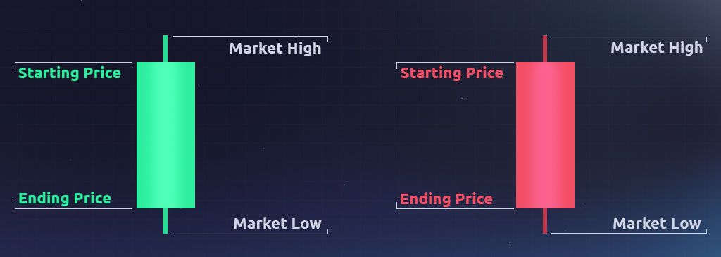
Professional traders use a combination of charts, each showing different information and trends. They can be visualized as line charts, bar charts, scatter plots, etc. The most popular type among crypto traders that Cryptal features is the "candlestick" chart. This style originated in Japan and visualizes the emotional component of the market by using size and color, showing the high and low price of an asset within a specific time interval. From this, a trader can see whether the market is bullish or bearish. A green candle means that prices are rising, while a red candle indicates falling prices. If the candle is red. the top of the wide line (the “body”) is the open price, and the bottom is the close price, indicating the price has fallen. If the asset closes higher than it opens, the candle is green and the prices are reversed. The ends of the narrow middle line (the “shadow” or the “wick”) indicate the highest and lowest prices reached.
The various candle lengths and positions provide different information:
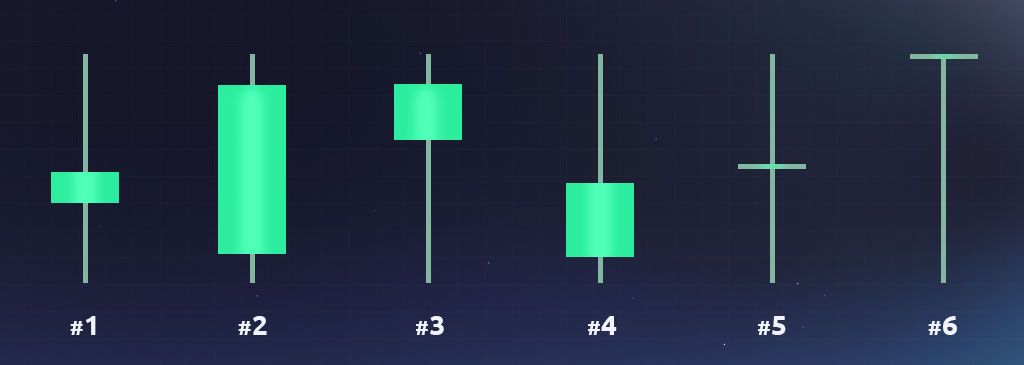
- A short candle body indicates a slight price change within the specific time period.
- A long candle body indicates a more significant price change during the specific time period.
- A short upper wick indicates that the price closed near its high point.
- A long upper wick indicates that the price closed nearer to its low point.
- A “doji” cross shows the asset had essentially an equal opening and closing price.
- The “dragonfly doji” tells us the asset's highest price was also the opening and closing prices.
Studying these signals can help you identify market trends and have greater success at spot trading. Stay tuned!